One of the tasks I had in getting the Linotype at the Mackenzie Printery and Newspaper Museum working was to repair one of the keyboard reeds which I had broken (I blame the service manual for failing to warn of the possibility of this happening).
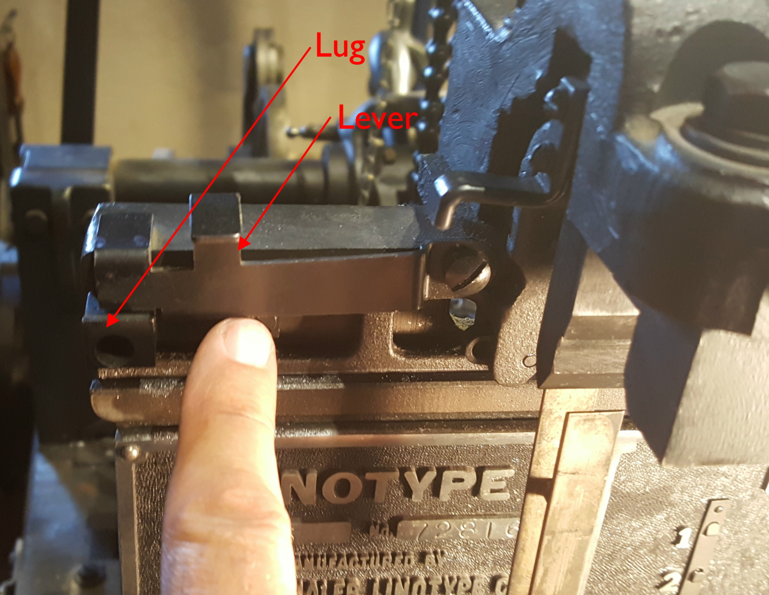
![]() The Linotype typically contains 90 of these push rods, which rise from the operator’s keyboard to the top of the machine where they operate an escapement mechanism to release a matrix which determines the shape of the letter. Each reed operates one channel in the matrix magazine to release a particular letter.
The Linotype typically contains 90 of these push rods, which rise from the operator’s keyboard to the top of the machine where they operate an escapement mechanism to release a matrix which determines the shape of the letter. Each reed operates one channel in the matrix magazine to release a particular letter.
The keyboard itself also contains short lower reeds which raise the upper reeds to release a matrix. The keyboard is mounted on a vertical pivot so it can be swung out for servicing, but if (due to a keyboard jam) one or more of the lower reeds is stuck in the raised position when the keyboard is swung out, they will strike the lower ends of nearby upper reeds. This can cause either the upper or lower reeds to be bent or broken off, or can damage the comb that keeps the reeds lined up properly. This is exactly what happened to this caster.
When swinging out the keyboard it is crucial to check for stuck lower reeds and manually raise the upper reeds as needed to clear the lower reeds, but the manual contains no such warning.
The lower reeds are soft enough steel that they can generally be bent back to their proper shape, but the upper reeds are hardened steel and so will break off rather than bend back.
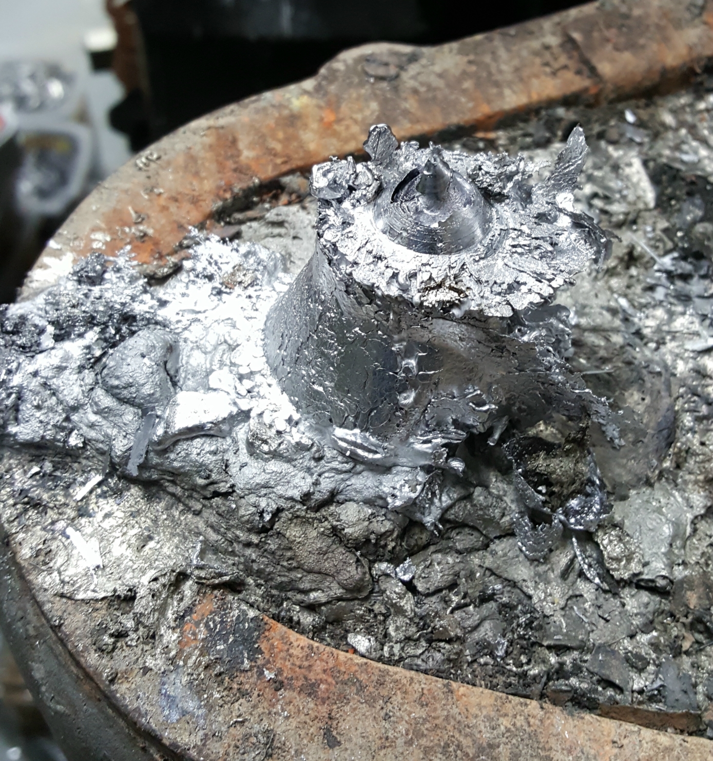
I repaired the reed by welding on a new bottom end, after cutting the broken end off clear of any guides it runs in. I’ve posted a YouTube video showing the intermediate steps (though none of the actual work).
It took me several tries to repair this: My first patch was cut from mild steel, and it was only when trimming the broken end that I determined the reeds are hardened steel and so using a mild steel patch would probably not last. My second (and subsequent) patches were cut from O1 tool steel which can be hardened, but it took me three tries shaping the joint and welding it before I had something that could be machined to the proper shape. The steel was partially hardened by the welding heat, and such a thin part is very difficult to anneal because the metal cools too quickly in open air. I did some of the shaping with a saw and files, but I also had to use some grinding tools in my Dremel to shape the hardened parts.
After adjusting the S-bend to the appropriate offset I hardened and tempered the part and reinstalled it in the Linotype, where it has been working fine ever since.
I actually did this repair in June 2022; I’m just slow posting about it.
The comb that guides the lower reeds was also damaged, and I have addressed that repair in a separate post.