
This is the first time I have cast this particular font, and although it mostly went well, I had one sort that miscast. The problem first showed up on a carbon-paper proof of the type: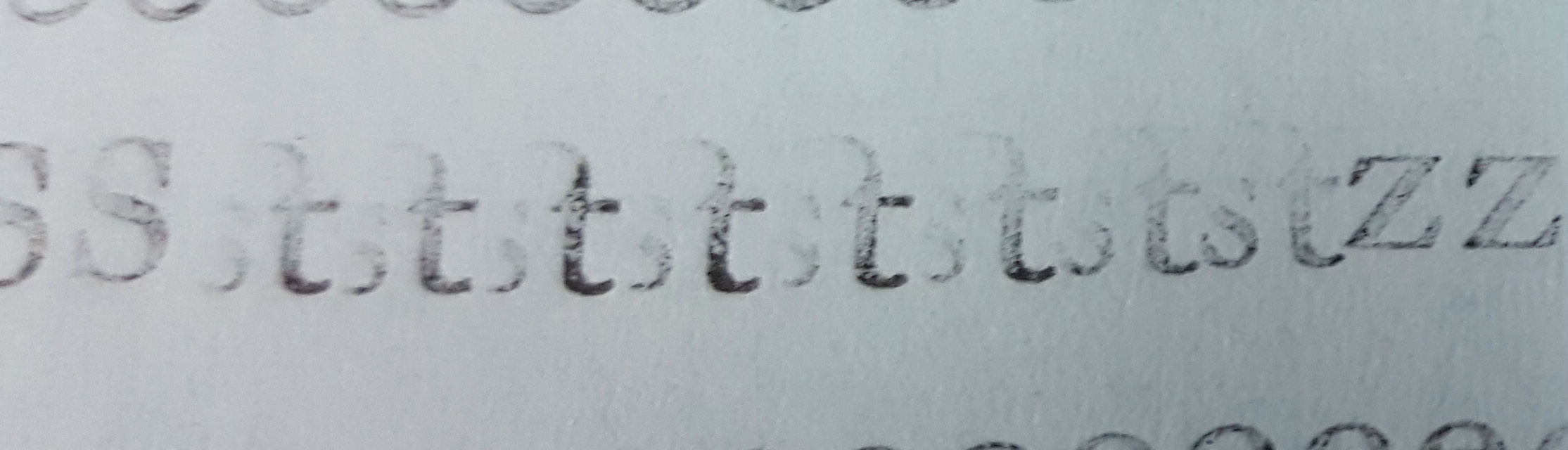 The ‘st’ ligature seemed to be tilted off its feet so the s was barely visible. A closer look at the type itself revealed the problem:
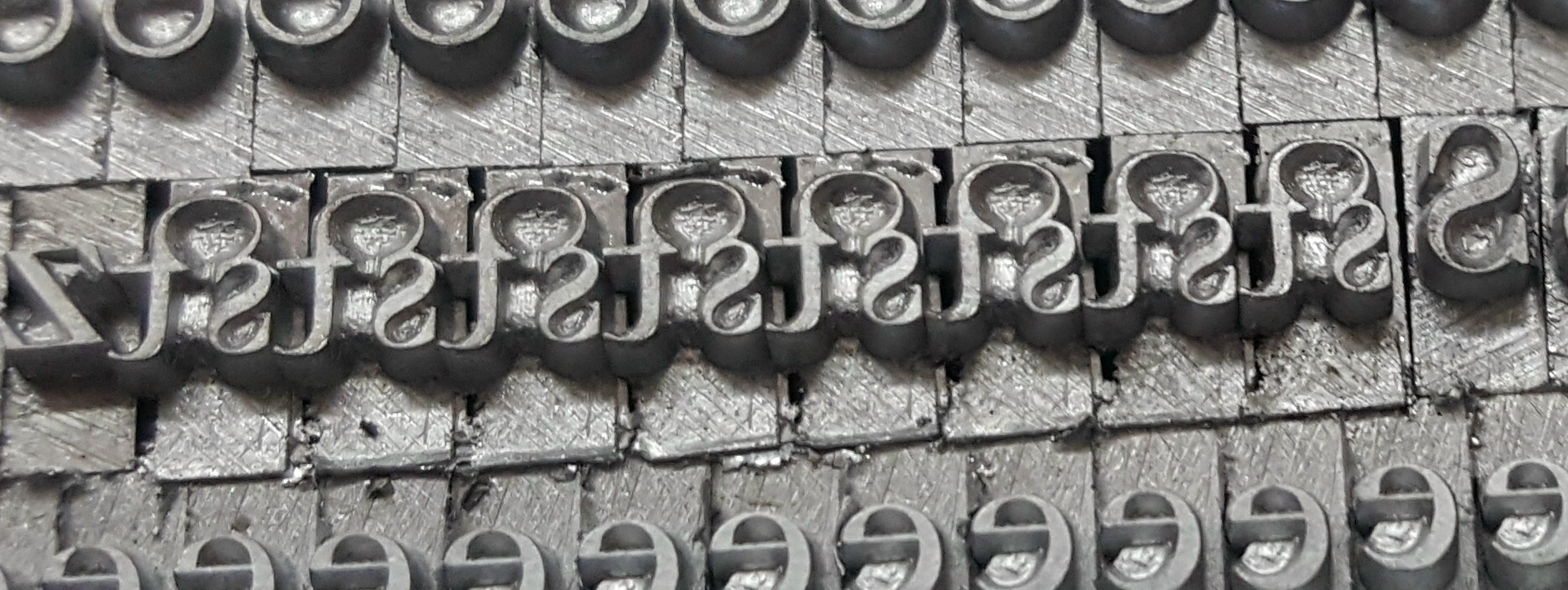 The body of the type was substantially too narrow for the width of the symbol itself, so tightening the form just pressed these beard-to-beard with no clamping of the body itself.
A look at the matrix revealed the source of the problem:
The matrix turned out to be a electro-formed duplicate made from a sample type. The matrix was originally for some letter in 14-point face #88 (Cheltenham Bold Condensed), which had been drilled out to host a new matrix. The width markings on the matrix were still those for the original sort, so I had to experiment a bit to find the correct width for the ‘st’ ligature.
I started by using a micrometer to measure the width including the beard, and did a test cast at that width. The type I measured had already had the beards crushed a bit by the lockup so this was a bit narrow and the new type still had a bit of overhang, so I widened a little more to 10 points, eliminating the overhang.
I then set a sample line, adding coppers and brasses to vary the effective width of the type, to see what width worked best. In this case the goal was to make the space between st and another t look the same as the space between two t’s.
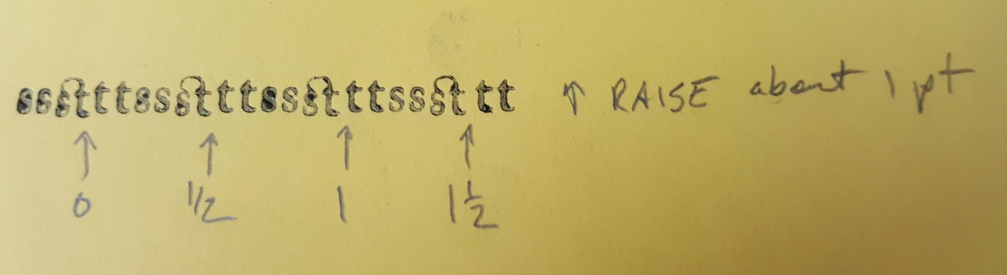
Overinked and annotated proof
The proof revealed that the vertical alignment was a bit low, and that an extra half point of width would look good. I adjusted the vertical alignment and cast more at a width of 10½ points (wedge setting * 10 4) and took another proof.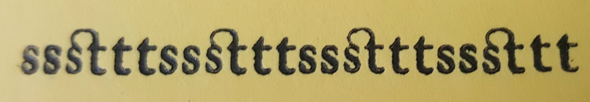 The result looked good so I cast some replacements for the type to include in the font. As a bit of validation, the width I came up with turned out to be exactly the sum of the widths of ‘s’ and ‘t’.
I’ve added an note in the box containing the matrices regarding the special width and alignment for this mat. I’m considering stamping the matrix with the correct width markings (not to mention size and face number), but first I have to decide on a good way of “erasing” the original marking. Just X’ing them out would leave little room for the new markings. Perhaps I could mill a strip off, making the matrices look like the stamped aluminum ones. I could also correct the alignment by milling a bit off the top edge of the matrix.
I was also casting some 18-point in the same face, and found that the uppercase T was casting about 0.009″ too high. This was a factory-produced matrix so I don’t know why the alignment is wrong, but the box now also has a note to adjust the alignment for this letter. This is harder to correct by modifying the matrix because it requires adding metal to the top edge.
I have since re-cast this font because the first casting had too many issues. Their resolution is detailed in this newer post.