
My previous casting of 18-point Caslon Old Style had enough defects that I ended up re-casting it. A couple of the problems are described herein.
After calculating all the adjustments to cast the ‘st’ ligature from the non-factory-made matrix, I was still unsatisfied with the results:
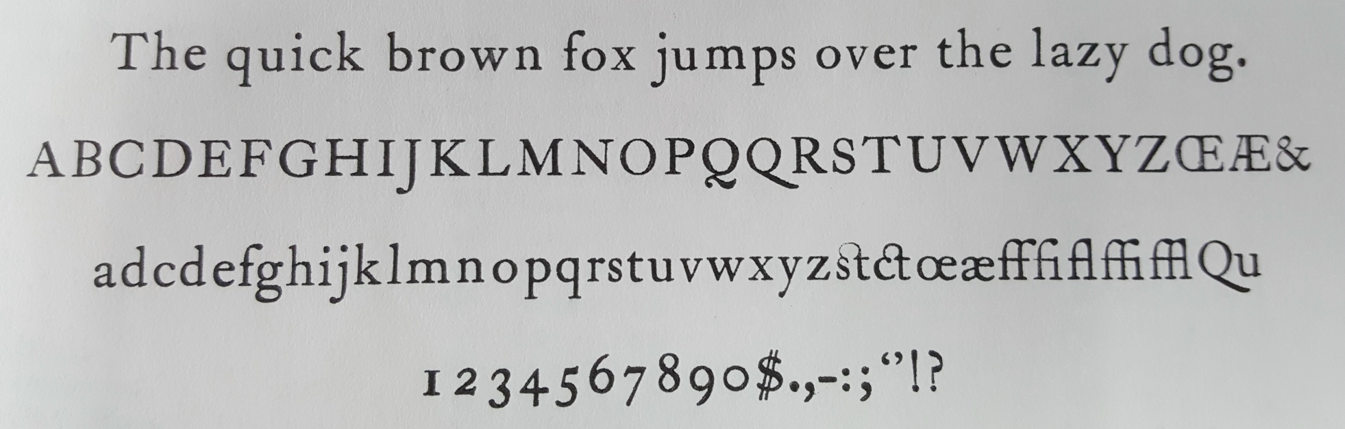
(Pay no attention to the typo in the lowercase alphabet)
Even though I had its width and alignment corrected, the ‘st’ ligature still seemed to be printing soft at the top.
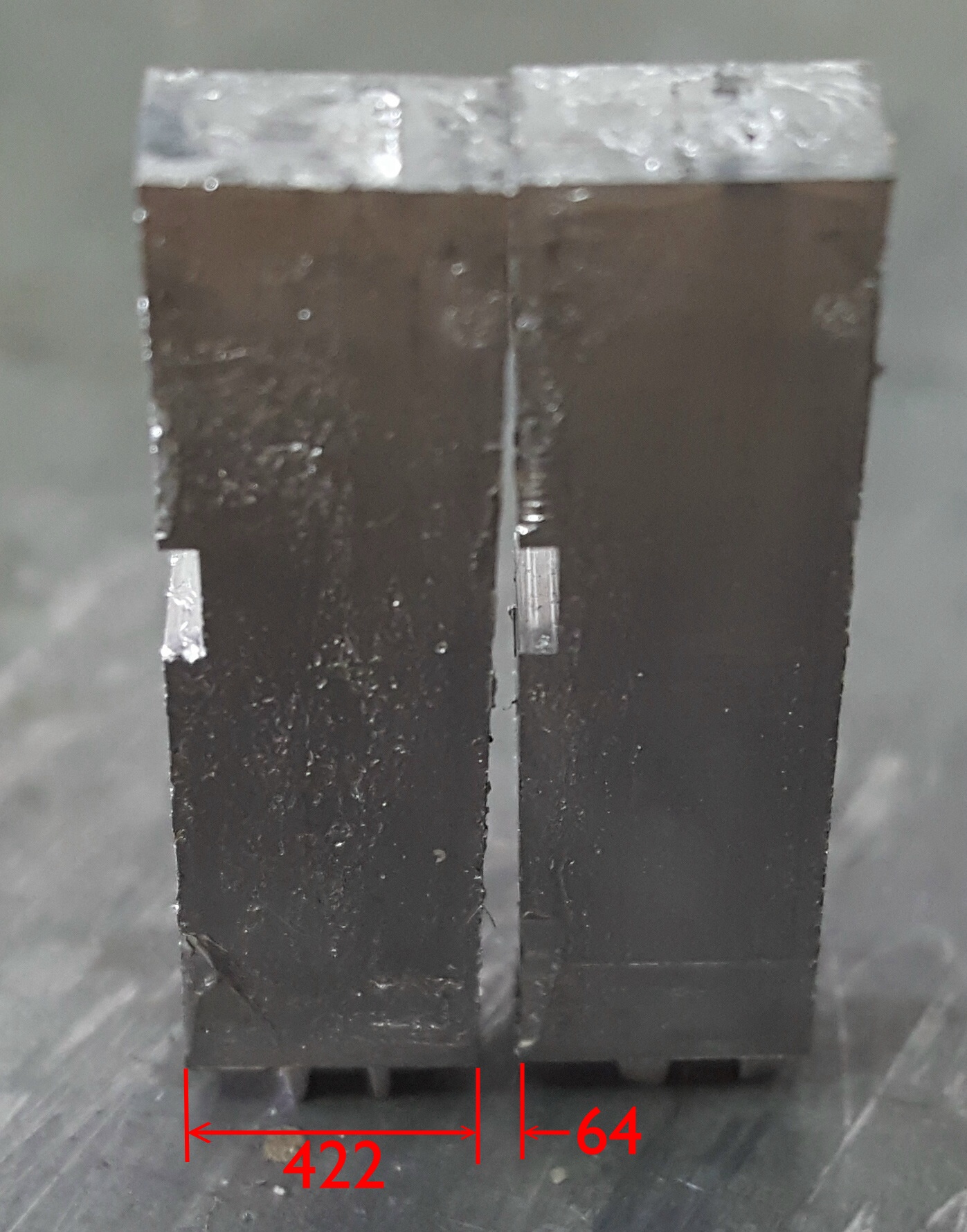
‘st’ on the left, capital ‘E’ on the right
Standing the type on its face showed that this sort did indeed have a slanted face: The measurement in the image are just in pixels, but knowing how deep the type was (18 points), how tall the type was (0.918″), and about how high the actual face of the type is (top of ascender to baseline, more or less the line standard 0.1591″) I can use proportional triangles to calculate that the top of the printing face is about 0.0065″ (about 0.17mm) low.
Unfortunately, correcting this is not something that can be done with caster adjustments. The mat would have to have its face and back planed to correct the angle, then built up again to get the correct depth of drive and overall thickness.
It turned out I had a much simpler way of fixing this: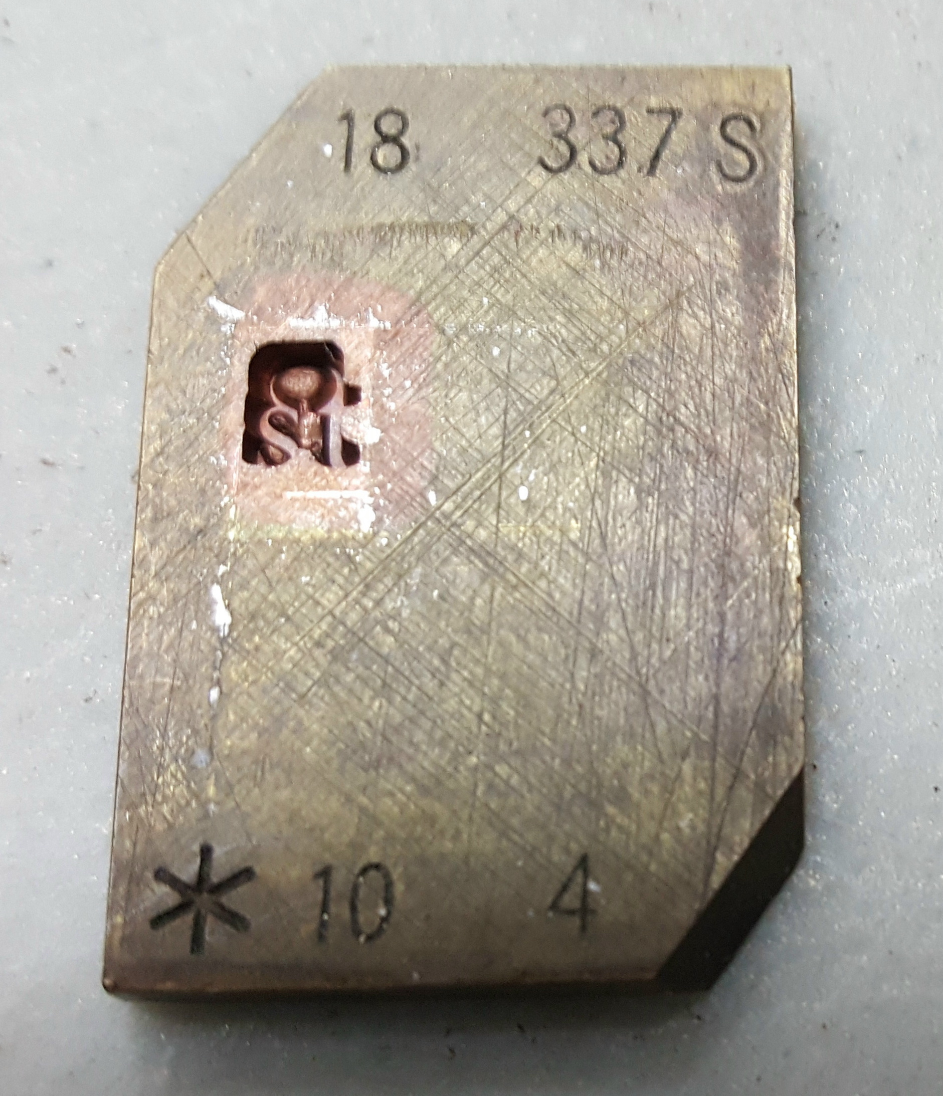 I had another set of matrices for quaints for 18-point Caslon O.S. which contained a factory-produced electrotype matrix in good condition (and with the correct markings). As a side note this verifies that my set-width estimate was correct.
I also ran into other flaws in the matrices for this font. At first, I thought it strange that the zero (these matrices have hanging figures) was not marked with the same width as the other figures, but a bit narrower. It also cast with a tiny overhang.
Later I noticed that the lowercase ‘o’ was casting too wide, and its matrix has a scuffed-out ‘F’ marking implying that it was a figure. Eventually I figured out that at the factory, the masters for the zero and ‘o’ had been swapped when making the matrices. The matrix with the zero had all the markings, including narrower set-width, of the ‘o’, and the matrix with the ‘o’ had all the markings for the zero, including the ‘F’ designation and a set-width to match the other figures.
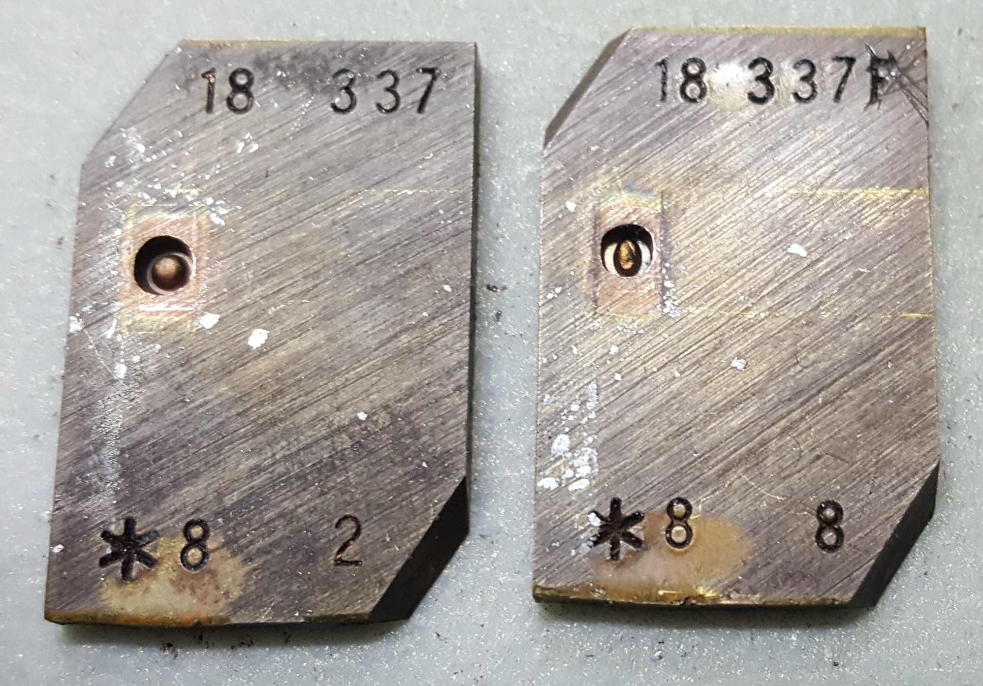
Zero on the left, marked as the letter ‘o’, and the letter ‘o’ on the right, marked as the figure zero.
Just to be sure I’m not the one mixing them up, here is the sample from the specimen book: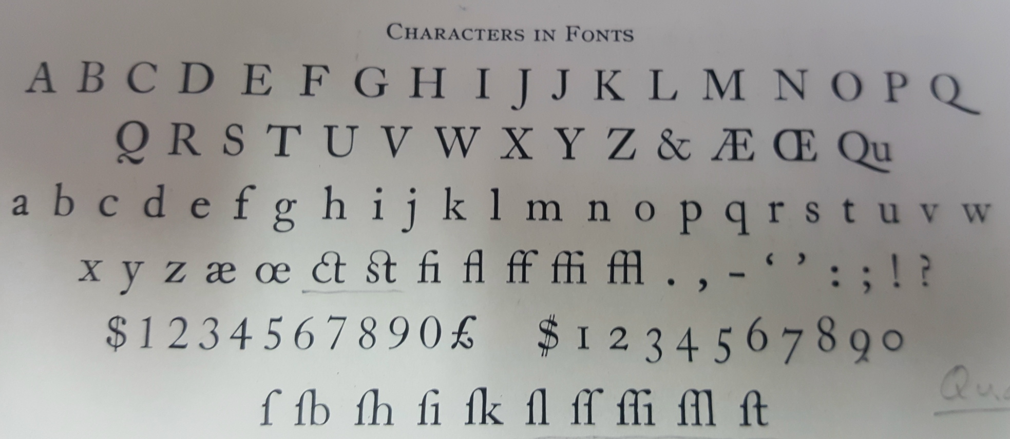 Comparing to both the matrices and my sample at the top of this post, it is clear that I don’t have them confused. The zero is an almost perfect circle of constant stroke width, while the ‘o’ is slightly off-round and has obviously varied stroke width.
A third issue which did not result in bad type but was a bit of a nuisance, was that the lowercase ‘p’ seemed to need an extra shim behind the matrix to make it seat properly on the face of the mould. Without this the top edge of the body of the type was surrounded with a sort of lion’s mane of squirt. What baffles me is that I measured the thickness of this matrix and it seems to be the same as many of the other matrices that cast just fine. I also checked for burrs on the face of the matrix and found none. The only thing left to check for (which I have not done yet) is a burr on a back corner of the matrix which could cause it to tilt instead of seating properly. My temporary shim only covered the centre of the matrix, directly over the mould cavity, so that could have seated the matrix flat.
p.s. You would need some knowledge of French-Canadian swearing to understand the title.
Leave a Reply