
On the Linotype at the Mackenzie Printery and Newspaper Museum, there are a couple of parts that I can’t find in any of the parts manuals I have:
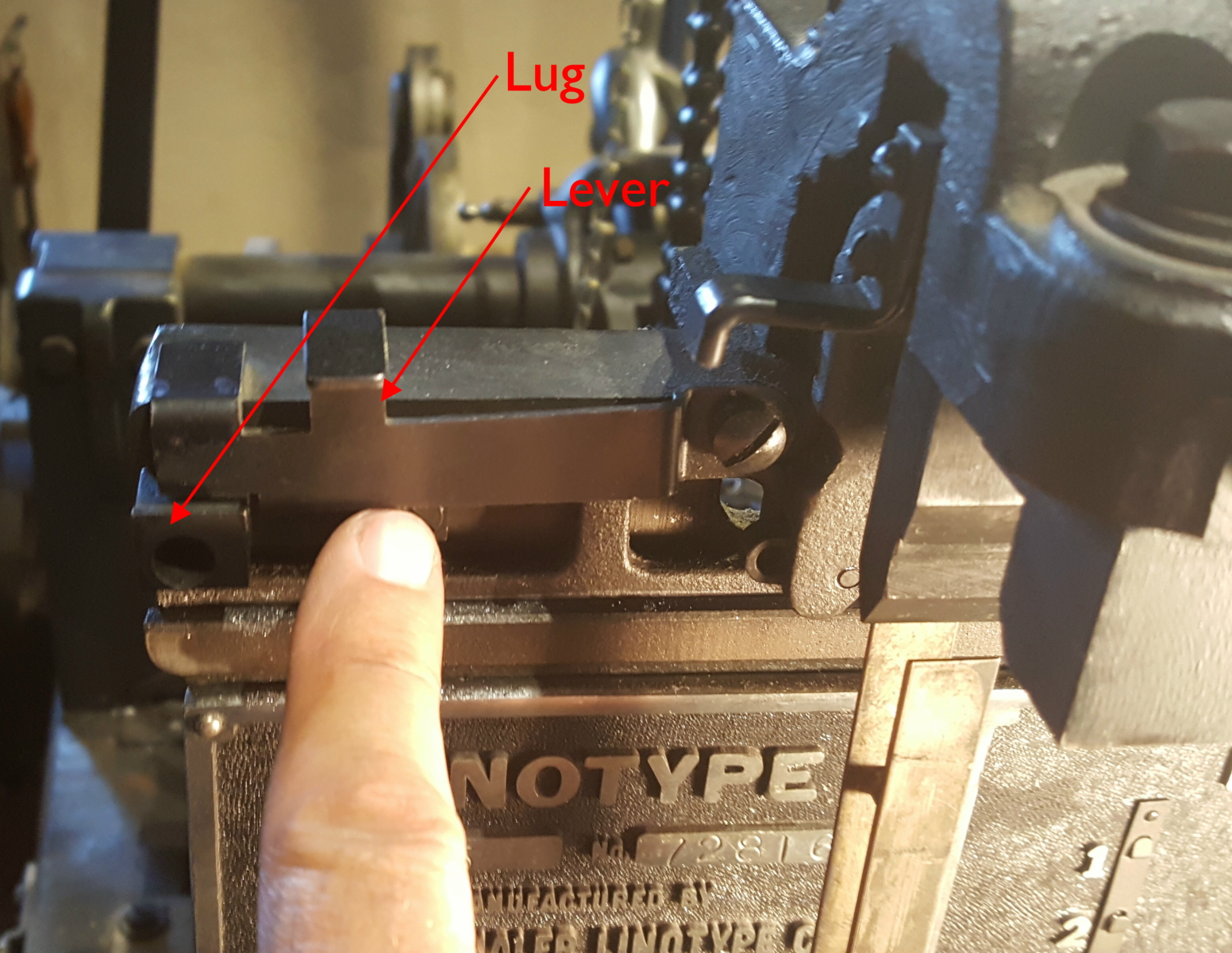 There is a lug on the slide that transfers the matrices from the first elevator to the second elevator, and a lever that, in its resting position, catches the lug and prevents this transfer. The lever is only raised to clear the lug when the first elevator is in its fully-raised position.
In particular, if the recast block is engaged, the first elevator does not rise completely (and the matrices do not all drop to the lower rail) and so the transfer is prevented. During the cycle the caster will stop when it finds the transfer has not completed and the operator will have to pull out the clutch control to bypass the stop, as which point the first elevator, still carrying the mats, will return to its idle position.
The caster already has a stop on the spaceband transfer pawl which is intended to prevent the transfer.
It would appear that the original procedure for recasting a line would be to engage the stop on the spaceband transfer pawl and also engage the recast block so the matrices would remain in the first elevator, allowing the same line to be cast again. If the operator set the recast block but not the spaceband pawl lock, I think the caster would push all the matrices out of the first elevator and dump them on the floor. Spacebands might just jam because the rail heights would not match between the first elevator and the second elevator.
So these mystery parts might have been introduced to make suppression of the transfer automatic when the recast block was in use.
But I still can’t find them in any parts book, nor in any catalog I could find for Star Parts (an aftermarket provider of Linotype parts and accessories).
So, can anyone comment on whether my analysis of the purpose of these parts is correct, or provide any reference for parts numbers or suppliers?