I recently cast a font of 12-337E Caslon Old Style from a 15×15 matcase using my Monotype computer interface.
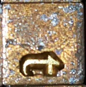
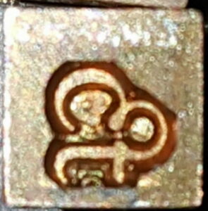
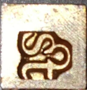
Upon rummaging around I also found that I had loose cellular matrices for the quaints in this font. That would be mostly the long-s and its several ligatures, but also include matrices for ‘ct’ and ‘st’ ligatures, so I decided to cast some of these to include with the font.
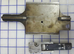
Rather than opening up the diecase to add these two matrices (and finding an appropriate location for them to get the correct width), I chose to use my 40A single cellular matrix holder (illustrated on page 104 of the Lanston Plate Book). This replaces the composition diecase, and the caster was manually positioned to H 6 to position the matrix under the centering pin (I could have used the computer interface and pneumatics to position this but I didn’t want to fire up the noisy compressor). By consulting a table in the rear of The Monotype Casting Machine Manual I found the settings for the justification wedges to allow casting these 14- and 15-unit types in row position 6 (normally 9 units). I engaged the dog (normally used for display casting) to force use of the justification wedges even without compressed air and cast the type.
The part I found odd was that the ‘t’ on the ligature hung over the edge of the finished type. I had to tweak the alignment by about 5 thousandths of an inch to remove the overhang so the ‘t’ in these ligatures would align just like a single ‘t’ in the regular font.
Looking at the matrices does not show any such misalignment. In these particular close-ups five thousandths of an inch would be about 10 pixels or 1/40th of the overall matrix size and would be clearly visible. Furthermore, the matrices are designed to be placed in the diecase with the regular font so you can do composition casting using the ligatures.
I’m at a bit of a loss as to why I got such poor alignment. Even if the matrix holder position needed some adjustment (by adjusting the draw rods), the matrix should still ultimately center on its cone hole (pushing the matrix jaw open if needed to allow the mat holder to shift). Such pushing around is of course in the long term rough on the centering pin and matrix cone holes (causing excessive wear), but the centering pin should be reliably strong enough to push the diecase around as needed. In any case I later checked the drawbar positions and they were fine—the centering pin was landing right in the middle of the matrix cone hole.
One thing, though, is that I was just finding the beard was overhanging the body of the type, so perhaps these mats have a wider beard than the regular ‘t’. I should cast some of these letters and proof them to see how the actual alignment turns out. If they truly have different alignment, in theory any computer program generating a ribbon file for composition casting could compensate for these matrices being out of alignment horizontally by kerning both sides, but that does not help when casting fonts.


Leave a Reply