My use of a photo editor to measure the hue and saturation of the paint colours paid off. I had inferred that I had to add to my new paint a mix of two parts red and one part blue. The correction hue at full saturation was a reddish magenta, but the mixed paint I added was a dark reddish brown. I think the resulting gray is about as close as I can get when trying to match gloss and semi-gloss paint.
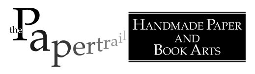
This shows samples under room lighting. Lower right is the good match, upper right is the previous match, and the small part in between is the colour reference I am using.
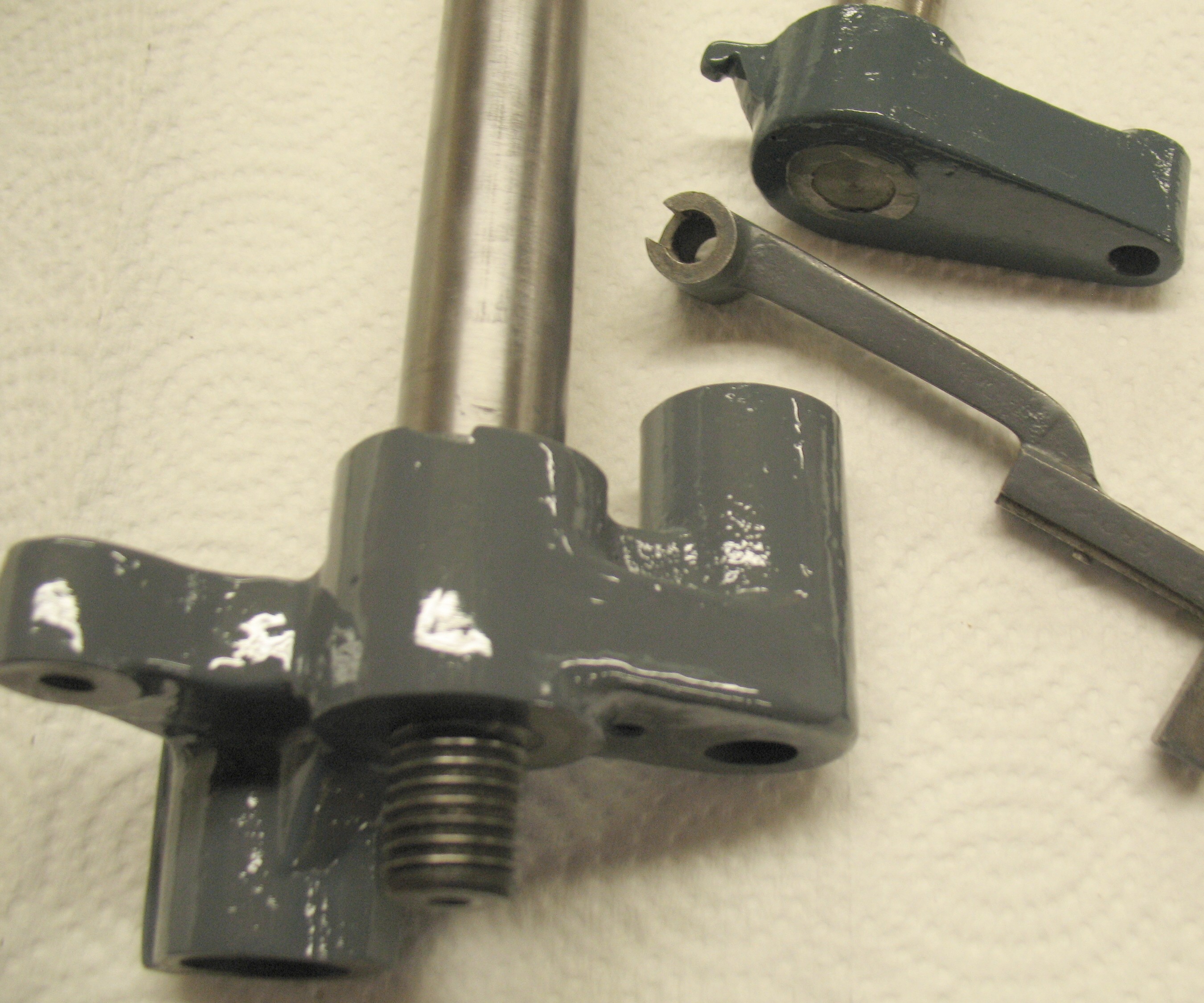
These are the same parts illuminated with the camera flash. The part in the upper right is much more obviously too blue-green.
My suspicion is that the original paint is a mix of litharge (basic lead carbonate, aka white lead) and carbon black, both of which are somewhat warmer tones that the modern gray paint which is more likely titanium dioxide and possibly iron oxide black.
Leave a Reply