Letterpress printing has a property called “ink gain” where the inked area left on the printed sheet is a tiny bit larger than the type used to do the printing. Because of this, when designing type (which includes designing the matrices) one has to make the type slightly lighter that the desired printing.
The actual amount of ink gain depends on several factors which come into play when printing, including the amount of ink applied to the type, the ink’s consistency, and the pressure on the form rollers. In theory the ink is only applied to the face of the type and so should produce print of the same size, but in practice, some ink ends up on the shoulders of the type, and even with clean shoulders, the pressure of printing causes the ink to squish outwards a bit.
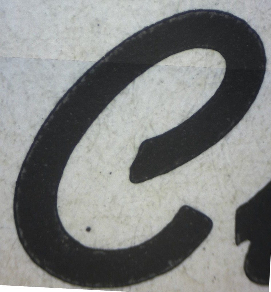
This shows the effect of ink gain on a capital C in 18 point Swing Bold, taken from Monotype’s own specimen book:

A magnified image of the C. The ink gain is actually visible because the edge of the type is marked by the outer edge of a faint lighter stripe where the ink was squeezed out. All the black area beyond that is the ink gain.

This is a superposition of two tracings. The outer pink outline is a tracing of the C from the specimen sheet. The inner darker contour is a tracing from a photo of the face of the actual type.
One thing that is, however, consistent is that for any given printing technique, the extra area caused by ink gain is a constant width, except around hairlines where there is less ink to squeeze out. This in turn means that you can’t make various sizes of a letter by scaling its image if the compensation for the ink gain is part of the letter outline. A letter properly compensated at a large size will have too little compensation when shrunk, and vice versa. The compensation has to be applied after scaling the letter to its correct size.
Based on theses tracings, it looks like the ink gain is about 0.0017″ which does not sound like much, but even on a relatively large (18 point) and fat face like Swing Bold this is about 7% of the stroke width and failing to compensate will make the cast type print too bold to match the rest of the font.
When using the pantograph, one way to get a fixed offset like this is to use an oversize tracer to trace out the template. Normally the diameter of the tracer should be equal to the scaled-up diameter of the tip of the cutter bit. By using an oversize tracer, the cutter is kept a fixed distance away from the scaled outline. So for instance if I were scaling down by a factor of 10 with the pantograph, I would want the radius of the tracer to be 10×0.0017 = 0.017″ oversize. This makes the diameter 0.034″ or about 1/32 of an inch larger than 10 times the cutter diameter.
This method will not work for letters with widely varying stroke widths or fine serifs, since once lines get fine enough the ink gain effect reduces. How fine? Consider how wide the light stripe is in the above image; as the stroke becomes narrow enough that the light stripes from either side meet each other, the supply of ink to squeeze out into the “gain” becomes limited. For strokes finer than that the gain compensation becomes some fraction of the width of the stroke. A fixed compensation by fudging the tracer size will no longer work and the compensation for the ink gain has to be part of the outline.
One other effect of the ink gain is that sharp corners on the type become rounded. This can be seen in the superimposed tracings where the lower end of the C has a sharp corner but the printed outline is rounded. The rounding isn’t even just a radius centered on the corner of the type but it is centered somewhere inside the corner. This is because the ink on the corner of the type is squeezed out in two directions, and so there is less ink available to cover more perimeter. There is a similar effect for inside corners, except that there is an excess of ink to squeeze out and it fills the corner more than would otherwise be expected. One can compensate for these effects, albeit imperfectly, and that is part of the art of type design.

Leave a Reply